Wednesday, 2 March 2016

Rucksack Concepts

Although I was taking the interiors approach to my practice, I still wanted to explore the idea of doing something fashion/accessory related as I'd done this in previous projects. I think my final prints could easily cross over between interiors and fashion but when I was developing my motifs I couldn't see the final image of having motifs which would be traditionally only suited to interiors on fashion. This is something in Unit X I need to steer away from as these are only limiting my work and how much I can explore certain designs and motifs. 

I feel like I also limited myself with colour schemes, as I set my mind on one colour scheme or design it stopped me from exploring the option of having any of my colour schemes on fashion/accessories. The dark blues I used in colour scheme 3 are a good example of learning not to limit myself to one area (see below). Here there is the same print on a rucksack and a sofa both with interesting results. I think the pattern works well on both but looks completely different and gives a completely different feel. In Unit X I will look back at this blog post to remind myself that in my practice I don't necessarily need to limit myself when it comes to prints, motifs or colour schemes.


Colour Scheme 3 Rucksack Concept

Colour Scheme 3 Sofa Concept 

Wednesday, 24 February 2016

Digital Processes

In this project I feel my digital techniques have developed, which has been helped by having a bigger body of traditional processes, having the large drawings with paintings and ink markings made the digital process a lot easier. By scanning in bigger file types it allow me to ensure a higher quality which will be useful when I start to use my work in a professional way. 

Sofa Concept

By learning how to use displacement maps it allowed me to showcase my work in a more realistic way, by applying my prints this way I can see how prints may or may not work for their intended purpose. In the concept above it shows a good indication of what it may look like but it still needs work, I need to focus on the finishing aspects such as edges and shading. In Unit X I will need to ensure my work is to a professional standard, even with concepts. 

Colour Scheme 2 Cushion Concept

In Unit X I think I need to experiment more with materials, in Photoshop it's not entirely possible to get a real feel for how the pattern will transfer onto different fabrics. Compared to the sofa concept using the displacement map this image isn't as clean cut. You can see where the image ends and it doesn't have the realistic effect, this is where my digital processes need some work when considering professional aspects. If I want to continue with producing prints for interiors in particular cushions I need to find a process that will allow me to do so and create concepts that are realistic for my degree show and further for professional use.  


Drawing Ink Processes


The idea for this work was to focus on creating textures and markings, not necessarily final pieces but designs that I could take into Photoshop and make prints from. By using various techniques with brushes and plastic syringes I have made a variety of marks with different colours. With these prints, I can digitally place them onto various platforms such as sofas, wallpaper and soft furnishing designs. Throughout I want them to stay with the idea in mind that they are for interiors. Reflecting on my work I need to focus on my colour themes more and ensure that I keep to the 6 colour schemes I am aiming for. I need to keep in mind that I can use these processes and techniques for future projects, by using the syringes it gives unique marks using both paint and ink.


By using the drawing ink processes I feel it has made a huge difference to my practice and how I think as a print designer. I already had colour palettes in place but by experimenting with techniques I found a new colour palette than ended up being my most inspiring at the end of the project. This ink process also made the digial aspect a lot easier, I had a large body of work of 70 A1 pieces of mark marking that aren't special individually but when put together with digital techniques turn into something quite special. 


Tuesday, 23 February 2016

Colour Scheme 2


Timorous Beasties Sofa
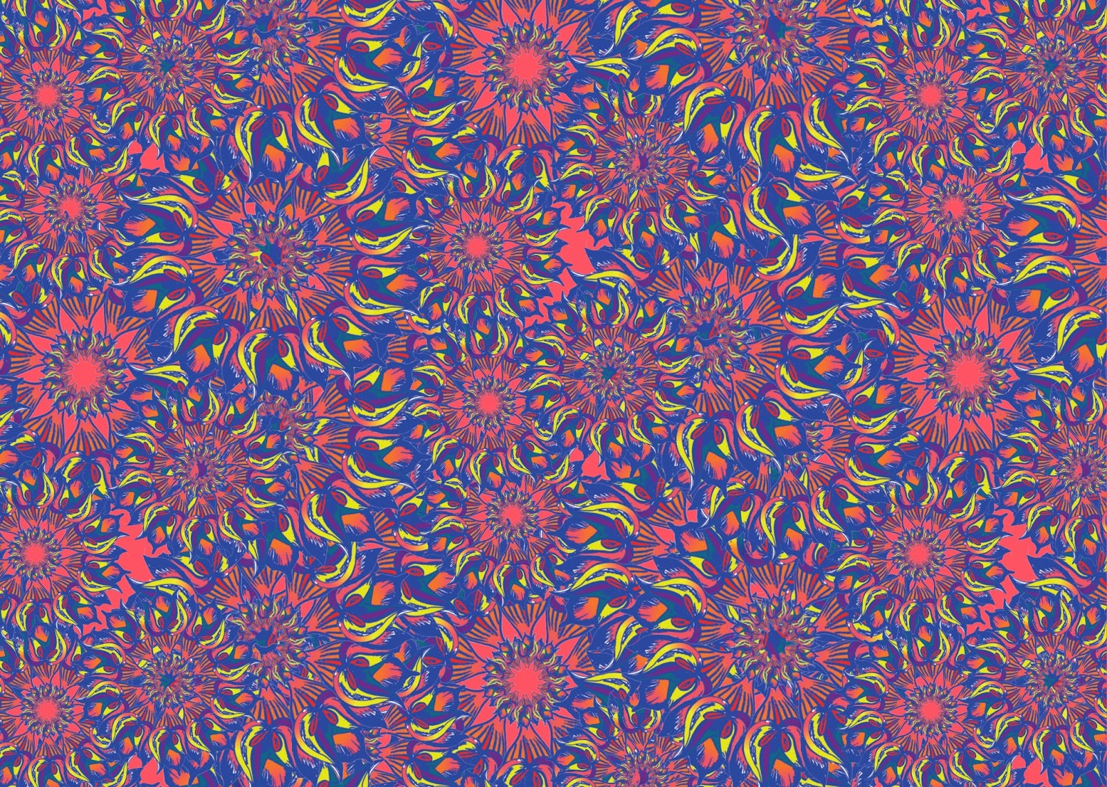
Initially when I started the project I went for very subtle colours with a mix of dark greys, teals and purples. None of my colour schemes had a lot of colour, which was something I didn't do intentionally, as I enjoy working with colour. After seeing the image below of a Timorous Beasties sofa and deciding to do some work with paint and ink to add more texture, I discovered a new colour scheme which inspired me more than the others I had previously. This made me realise I was playing it too safe with my previous colour schemes and not creating work I truly wanted to create or work that would reflect my practice after university. I regret not being more adventurous from the start as it would of been interesting to see where my work would of progressed to.
I think this print shows how my work has developed and I've understood the importance of having a good body of work, by having a good range of ink markings I could apply them into Photoshop and make intricate looking patterns with simple methods. The idea behind my project was to create patterns that looked intricate (patterns within patterns) that had texture with digital techniques. I think this pattern is a good product of what I wanted to achieve. I am excited to take this print through to Unit X and potentially see it on a product. When you compare some of my earlier prints you can see that my work has progressed immensely and now I'm starting to see some work I would be happy with in a professional setting. 
Final Print

Monday, 15 February 2016

Motif Development

 As I wanted to create patterns that looked intricate without the long processes that they involve, I decided to play with them in Photoshop and Illustrator to save time. The pro's of doing this is that I can easily change colours between colour schemes and different colours within the same colour scheme. As I enjoyed the traditional processes more in this unit and focused heavily on my drawings it made the digital side a lot easier. Also, with what I've learnt throughout previous projects I know what type of drawings work best in Photoshop and Illustrator so when I'm doing motifs I can imagine how they're going to work digitally. 

With this pattern I regret not making the quality slightly better, on the computer screen it looked okay but when I went to print it out it wasn't the best resolution it could be. This is a shame because the pattern is the final stage and to realise this at the last minute makes all the work before it useless as well. With Unit X and future projects I need to ensure I'm always working at a good quality resolution to stop this happening.  In Unit X I really want to get some sampling done as I haven't done any and I need to ensure my work is top quality before doing any type of fabric printing.


Thursday, 4 February 2016

Material Investigation

From the colour schemes I have chosen they are full of bright colours which leads my audience to be a higher market, when looking at the consumer the average person may not fill their home with such unique colours. This colour palette gives important consideration to the materials that may be used, with potential in Unit X to develop my prints onto fabric.

Looking into materials has been slightly difficult due to time scales, material investigation is something that is usually far down on priorities in my practice which is something I need to work on in Unit X and after university as it can change the colour and value of any of my designs.

The materials I imagine my patterns on for cushions, are luxurious such as velvet or silk. As I want the cushions to be for a higher market, I want to add tassels and fringing as it just adds more texture. When discussing the idea of tassels it really me a vision of what my work could potentially look like, for my degree show I want to explore this further because it could be a potential career path.


Friday, 4 December 2015

Colour Schemes


Colour Scheme 2
Working with more than one colour scheme has really been a challenge for me, in previous projects sticking to a colour scheme has been something I've struggled with. At the start of the unit I was working with very dark, muted colour schemes and not really stepping out of comfort zone. I created my colour schemes digitally and didn't have any intention of exploring any others. When I started researching for my motifs, especially with the intricate patterns I found that a lot of what I was researching had bright colours and also made the smaller details stand out a lot more than they would with darker colours that might be more similar. 

When I saw the Timorous Beasties sofa and got inspired to start working with inks it opened up a whole new colour palette that featured a lot of bright pinks and oranges. It ended up giving me inspiration for a lot more work and I found myself producing page after page of markings but then when I went into Photoshop I had more work than I knew what to do with because I liked the colours and marks more than any of the work I'd produced previously. 

Colour Scheme 3
By limiting myself at the start of the project I missed potential time to explore these colours more which could of allowed me to create more work. I think the prints I created with colour scheme 2 which featured the pinks and oranges is some of the best work I have produced so far. I had forgotten how much I enjoyed working with colour like I did in my art foundation previously and it really gave me some inspiration that I had lost in previous projects. 

In Unit X I need to remember the importance of colour and what it can do to a project, by finding this new colour scheme it completely turned my work around. If i start to lose inspiration I know I can go back to looking at colour and mark marking and hopefully see the same results I have in this unit.


Thursday, 12 November 2015

Initial Drawings


As I had a late start to the year I had to catch up by producing a lot of drawings, I decided to a sketchbook but they were all of a similar size with a similar media such as pens and markers. After I'd had a lot of these I decided I needed something which involved colour and I needed to explore the size of my drawings. I started to create some larger drawings on A1 and start to explore colour. As I wanted the intricate designs, by doing it on A1 paper they are big drawings but when they are in Photoshop or Illustrator you can't necessarily see the size. 

By doing these big drawings it's given me a good idea of how to build up the body of work for the unit which I think I have struggled with previously, all of these techniques give me a lot more to work with. Especially with the bigger drawings you can really chop them up and zoom in a specific area and find different markings and textures within one larger drawing. 

The issue I had with the bigger drawings compared to the smaller ones is that my drawing style tends be to quick and free flowing with no real plan, so with the big drawings I would be working on them for longer so found myself getting bored especially with the more detailed parts. As you can see in the image above there are some parts missing but getting bored with the bigger drawings gave me a reason to explore different textures to fill the bigger spaces. 

Friday, 4 September 2015

Practice


Deciding on my practice has been very difficult, my idea has changed several times for the direction I want to go with. In previous projects I have applied a lot of patterns to t shirts which is the direction I thought I wanted to go in, I started making designs and thinking about what direction I could go in. I struggled to find inspiration and where this could lead within my practice. Interior is something I've always been interested in but never saw it as my practice or potential career. Looking for inspiration, I kept going towards interior more so than fashion. 
Looking back at my projects from last year the one I felt most proud of and that I excelled in the most was the habitats brief, I started off with a lot of line drawings and developed them into prints. These were some of my best prints and my skills have only grown since then so they can be taken even further. After researching these are some micro trends for interior accessories:


AW15/16 FOR INTERIOR/

1/BRINGING THE OUTDOORS IN
2/REFERENCE TO NATURE
3/GEOMETRIC TILES
4/WARM METALS
5/MIX METALLIC AND METALS
6/SIMPLE REPEATS
7/HAND RENDERED TYPE


RESOURCES/

/JOHNLEWIS
/LAKELAND
/ORLA KIELY
/SPOONFLOWER

Tuesday, 4 August 2015