Wednesday, 20 April 2016

Developed Cushion Concepts

After the first attempt of pinning the fabric samples to cushions and not being happy with the results, I decided to order larger samples in an A3 size so they would fit onto actual cushions so I could get a better idea of what they would look like not only individually but together as a group. 
Cushion Concept 1

Once again I followed the same process of pinning the samples and the trimmings as well. Another improvement I made was photographing the cushions on something where they would potentially be used by the target audience. 

By ordering the larger sample sizes I was able to find a larger selection of cushions to apply them to. This process helped me a lot when it came to deciding on what I wanted for the degree show. It also helped me make the decision when it came to the finishes on my cushions. I was really happy with the colours and patterns that fit together.
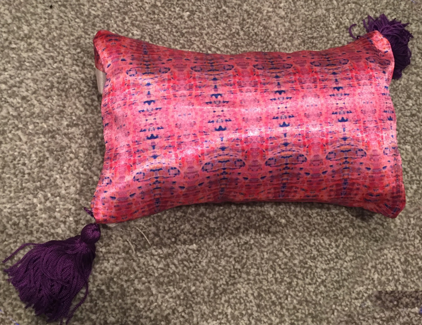
Cushion Concept 2
Before doing this process, I was worried that the cushions would be too much with the bold colours and patterns together but by taking these pictures it's allowed me to step back and see things from a different perspective after seeing the samples for so long. I hadn't previously arranged the cushions on something flattering for the arrangement but I think this purple in concept 2 really brings out the colours of the cushions and completely changes my mind set. 


Cushion Concept 3
 Cushion Concept 3 is the almost the finished article I envisioned, I wanted two normal sized cushions at the back, with two rectangle cushions and one smaller square cushion at the front of the display. This was hard to achieve with just my samples as they wouldn't have fit onto larger cushions than pictured but by having two rectangles I know which prints look better on what shape. 


Friday, 8 April 2016

3D Cushion Concepts

After receiving my fabric samples I decided to use these samples to create cushion concepts to get an realistic look of what my cushions would look like. The issue I had is that I couldn't find any cushions small enough to fit on my A4 samples, after searching I decided to use some of the fabric samples I wasn't as happy with and made a simple cushion out of them with toy filling. 


As hand stitching is not something I'm particularly
good at I was trying to avoid this method as long as possible but eventually gave in and decided just to go for it and see what I could come up with. These also served as a great tool to apply patterns in Photoshop to make them look slightly more realistic. Another big reason for doing this is that because I want to have different trimmings on my cushions I need to see how they work colour wise and with certain patterns. 


This concept was really the only one that worked, it allowed me to apply the pattern how it would look when made properly and also how the tassels would look against the pattern. I'm still not completely happy with this method, it's not quite working for me and what I'm trying to achieve. 


Thursday, 7 April 2016

Initial Prints


My initial prints came from motifs from the practice unit, in the unit I produced so many drawings and mark makings that towards the end of the unit when it came to looking at making prints, I had forgotten a lot of the motifs I drew at the very start of the project. As the practice unit was all about detail and texture I decided to take these motifs and make unit x about colour. In the practice unit I wasn't brave with colour until the end of the project so I didn't get chance to explore colour as much as I'd like. So already having the motifs and experiments from the practice unit it's allowed to make unit x all about colour.

All of the prints I've made so far have been very busy with a lot going on, I want to explore more different repeat styles, so not every motif is so busy. When it comes to the collection at the end of the unit I want to have a variety of different styles to show how versatile I can be. With the work I am producing in this unit I want to be very aware of the image I project for my portfolio or future employers. 

Friday, 25 March 2016

Unit X

After the practice unit there were two main aspects I wanted to focus on, being more brave in the initial stages with colour and investigating the materials to take my work to a more professional level. I did a lot of drawing motifs and mark marking in the practice level so I felt that a lot of these would still be relevant in unit x.

By this point I know that the prints I create will be for interiors/soft furnishings so this will be where I start my research. In the practice unit I was advised that by using bright bold colours you are aiming at a more expensive audience, so I will be aiming my work to a higher price point and this will reflect in what I make. This is why I want to do a lot of material investigation to ensure every aspect is following the higher price point.


Matthew Williamson uses bright colours nicely and his prints and used cross over from sofas to stationary to fashion which inspires me as I like the idea of patterns having more than more use. This is also a good mind set for after university as if I was to work freelance being able to offer a service which crosses over different areas. In unit x I aim to create versatile prints than can cross over. 


Thursday, 24 March 2016

Evaluation


Throughout my practice I have been creating a range of prints mainly for interiors. As the last project I wanted to ensure I worked on the faults I’ve had in another projects and establish the style and techniques I am good at and enjoy. At this point in my practice I should know what I’m good at. Looking back at my first blog post I was still unsure but I felt this unit has helped me significantly. I have discovered new ways to create a body of work which makes designing patterns and prints a lot easier.


From the start of the project, I regret that I wasn’t as brave as I was towards the end because I would of got a lot of unique results that reflect the work that I enjoy making. At the start I was using more muted colour schemes and focused a lot more on the motifs. I found that when I came out of my comfort zone and moved away from Photoshop I found techniques that made my practice a lot easier and more enjoyable. When I broadened my techniques, especially by using the inks I found a new colour scheme that really reflected what I enjoy making and how I want to be as a professional, this resulted in a large body of work in comparison to previous projects. In Unit X I can take this new found confidence and reflect it in work.


As I had such a big body of work, looking back I wish I had managed my time better so that I could of explored certain aspects more, as I said previously I developed a new colour scheme from my ink mark making and I enjoyed it so much I think it took up a lot of my time and I didn’t develop my other colour schemes as much. Saying this, the mark makings I did within this colour scheme was some of the best work I think I have created so far and helps me see what kind of work I want to make in Unit X and after university as well.


Although I have done a lot more traditional techniques rather than just the digital techniques I usually do, there needs to be more material investigation in Unit X. I didn’t take my material investigation that far so I need to see how my prints transfer to different materials. Within interiors it’s really important to have good quality materials that fit their purpose as well as the aesthetic so I need to investigate this more in Unit X.


In Unit X, I want to ensure I investigate materials in detail, I already have a body of final prints that I want to develop into a product and make them into a collection of potentially soft furnishings. The final prints I made could potentially reflect my work after university as a professional designer so I want to ensure I show them in the most professional way at my degree show to showcase my own style.

Wednesday, 2 March 2016

Rucksack Concepts

Although I was taking the interiors approach to my practice, I still wanted to explore the idea of doing something fashion/accessory related as I'd done this in previous projects. I think my final prints could easily cross over between interiors and fashion but when I was developing my motifs I couldn't see the final image of having motifs which would be traditionally only suited to interiors on fashion. This is something in Unit X I need to steer away from as these are only limiting my work and how much I can explore certain designs and motifs. 

I feel like I also limited myself with colour schemes, as I set my mind on one colour scheme or design it stopped me from exploring the option of having any of my colour schemes on fashion/accessories. The dark blues I used in colour scheme 3 are a good example of learning not to limit myself to one area (see below). Here there is the same print on a rucksack and a sofa both with interesting results. I think the pattern works well on both but looks completely different and gives a completely different feel. In Unit X I will look back at this blog post to remind myself that in my practice I don't necessarily need to limit myself when it comes to prints, motifs or colour schemes.


Colour Scheme 3 Rucksack Concept

Colour Scheme 3 Sofa Concept 

Wednesday, 24 February 2016

Digital Processes

In this project I feel my digital techniques have developed, which has been helped by having a bigger body of traditional processes, having the large drawings with paintings and ink markings made the digital process a lot easier. By scanning in bigger file types it allow me to ensure a higher quality which will be useful when I start to use my work in a professional way. 

Sofa Concept

By learning how to use displacement maps it allowed me to showcase my work in a more realistic way, by applying my prints this way I can see how prints may or may not work for their intended purpose. In the concept above it shows a good indication of what it may look like but it still needs work, I need to focus on the finishing aspects such as edges and shading. In Unit X I will need to ensure my work is to a professional standard, even with concepts. 

Colour Scheme 2 Cushion Concept

In Unit X I think I need to experiment more with materials, in Photoshop it's not entirely possible to get a real feel for how the pattern will transfer onto different fabrics. Compared to the sofa concept using the displacement map this image isn't as clean cut. You can see where the image ends and it doesn't have the realistic effect, this is where my digital processes need some work when considering professional aspects. If I want to continue with producing prints for interiors in particular cushions I need to find a process that will allow me to do so and create concepts that are realistic for my degree show and further for professional use.  


Drawing Ink Processes


The idea for this work was to focus on creating textures and markings, not necessarily final pieces but designs that I could take into Photoshop and make prints from. By using various techniques with brushes and plastic syringes I have made a variety of marks with different colours. With these prints, I can digitally place them onto various platforms such as sofas, wallpaper and soft furnishing designs. Throughout I want them to stay with the idea in mind that they are for interiors. Reflecting on my work I need to focus on my colour themes more and ensure that I keep to the 6 colour schemes I am aiming for. I need to keep in mind that I can use these processes and techniques for future projects, by using the syringes it gives unique marks using both paint and ink.


By using the drawing ink processes I feel it has made a huge difference to my practice and how I think as a print designer. I already had colour palettes in place but by experimenting with techniques I found a new colour palette than ended up being my most inspiring at the end of the project. This ink process also made the digial aspect a lot easier, I had a large body of work of 70 A1 pieces of mark marking that aren't special individually but when put together with digital techniques turn into something quite special.